Of A Different Color

Earlier this week, at the store where I’d gone to buy new running shoes, the young saleswoman and I agreed about which pair seemed to fit me best. But I didn’t buy them. They were green. Lime green. Neon lime green. The other options: orange, crimson, and an eye-popping purple and teal combo. I left with another brand I liked just as well, and, as important, in an easier-to-live-with blue and black.
As it so happened, the next stop on my errand run was the hardware store, my single mission there to select some paint chips as possible colors for a few walls in our house. This should’ve been easy – my palette when it comes to home décor is, by intention, fairly limited. But the amount of time I spent perusing the Benjamin Moore color kiosks was so protracted, it even seemed to arouse curiosity if not suspicion in a young clerk who meticulously stacked and restacked a nearby display of bagged sidewalk salt and re-arranged a phalanx of snowblowers for which an anything-but-normal Chicago winter has yet to elicit much demand.
Color is important to me, although, were you to open my clothes closet, its preponderance of black and grey may suggest otherwise. As would my interspersed “splashes of color” – muted shades of brown. And the occasional green that, I assure you, is neither neon or lime.
I’m reminded of a Barbara Hurd essay. In it, she recounts an episode when, at age 14, she and her mother went shopping for winter coats. Her mother kept selecting green coats from the racks, in shades Hurd describes as “emerald,” “jade,” “apple green,” and an “almost lime.” Hurd wanted brown. Standing before a mirror, her mother held up a green coat to her daughter, declaring the color turned her hair golden, made her face more vibrant. But Hurd did not recognize herself. She plucked a camel-colored coat from a rack and held that up instead. “But that one,” her mother exclaimed, “makes you look like a sand dune.” Which clinched it. Writes Hurd, about loving such a comparison, “all those shadings, the shadows on its curves, the way something as invisible as wind could change its shape.” For her, color was not about complementing skin tone, improving vivacity. Later in the essay Hurd gets into her themes: how or why some of us want to blend in unnoticed with our surroundings, and how what we attempt to camouflage can be more revealing than a bright costume or masquerade.
Neon lime clearly doesn’t say me. My preferred wardrobe choices with, apparently, the default set to my go-to black, has evolved by way of what’s most comfortable, easy, and, especially when packing for trips, requiring the least amount of thought. The paint chips, however, were another matter.
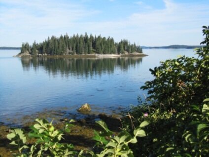
For wall paint, I naturally gravitate to that part of the color wheel favoring beige, tan, cream, and myriad off-whites. Any deviation has been in the realms of mushroomy browns or the palest sage greens. These, I’ve found, have longer “shelf-life.” They marry well with art and rugs and, especially in the case of our island house, don’t attempt to upstage the native landscape and views beyond the windows. It’s fairly safe to say that the colors on my walls, in the bed linens, upholstery, or even the dishes on the table are primarily those occurring in the natural world. Best I know, green lichen splotching rocks in the woods or shores may be bright but is never neon.
What such choices reveal about me, I can’t say. But coming to recognize them a few summers ago may explain the exercise I self-imposed then: naming our house’s rooms based on their predominant colors and what of the natural world they evoked. For our bedroom, I chose Birch. The living room I privately christened Driftwood. Another bedroom became Fern. The study induced Bark, and the guest room, given its here-and-there smatterings of deep red, earned Bunchberry. It was as if I was about to turn our house into an inn or B&B with thematically-named rooms. Over the years, I’ve stayed in such places, put my head down in Rose or Iris. In Robin or Goldfinch (no matter that in my customary black, it may have been more appropriate to park me in a room called Crow.)
Such an exercise, needless and somewhat silly, may have been the product of some inexplicable musing. But then I’ve always been attracted to and intrigued by names, even when it comes to colors. Surely, I’m not the only 60-something who remembers her favorite Crayola color. Burnt Siena – and not so much because of the color itself but the exotic notion of it, the sound of the words. Though I was too young to understand the reasons behind Prussian Blue being renamed Midnight Blue, I nevertheless missed the former moniker, although, years later, after I’d outgrown much crayon use, I did appreciate the wise civil rights era change of Flesh to Peach. Since, Crayolas have evolved into 120 colors that now include atomic tangerine (seriously?), macaroni and cheese, and, improbably, manatee and inch worm, names that, regardless their corresponding color, are likely to evoke in the mind some vivid pictures.
I remember, too, when the catalogue retailer J. Crew burst onto the scene 30 years ago with its new, youthful and layered casual look. Almost creating as much stir was its then novel way to name color choices, often involving something edible. While cantaloupe and espresso may have seemed novel then, today they’re mundane. More recent J. Crew’s recent offerings read like a menu – sweet guava, honey glaze, sour lemon and bright rhubarb. For variations on brown, they’ve wisely chosen burnt caramel and toasted almond rather than, say, liver or tripe.
Often, of course, there are disconnects between actual colors and the objects depicted or evoked. Indeed that’s what tripped me up with paint chips in the hardware store.
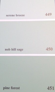
There, hanging out in my customary domain of the off-white spectrum, I discovered Woodland White is actually a pale green. Because, I wondered, that’s the color that white takes on when lit through leaves? But what about Cedar Path? Shouldn’t it have more rust to it, given the probability of dropped needles underfoot? Does a Serene Breeze in summer say green on our skin? Why not something more blue? And Stolen Moments may suggest the theft of time, but, given its lemony green, from where or whom? Turning Leaf should have some orange in it, no? But maybe the browner-toned Autumn Leaf is meant to evoke the oak, its few crisped remnants rattling overhead after all the others are gone. I admit to having trouble letting Summer Harvest in its sole color evoke the multi-hued bounty I carry home from a late August visit to the island’s farmers’ market. However, I can’t weigh in on whether pale-green Baby Turtle is accurate to any turtle offspring anywhere on the planet. I’d say, based on my early morning walks in our woods, Benjamin Moore got Misted Fern just about right, but I’d like to suggest that Tree Moss might be better paired to its depicted color by switching moss to lichen, given the ample evidence provided by encrusted tree trunks outside my study window. And the brown tones in Fields of Gold? Accurate only if it’s late September and the goldenrod and tansy have long gone by.
I love the greens of spring, greens like no other – intense, insistent, irreducible. So I might object to Spring Bud being so pastel, and absent, it seems, any pulsing urgency. But maybe this is the color of the thin, delicate, and short-lived membrane cloaking an emerging apple blossom just about to burst forth. And thus proving that closer inspection of the world around us is often required. Of what’s not in the limelight. Of what seeks shadows. Of what dwells briefly and is hard to miss. And of what shelters, inhabits, announces, or disguises. In all gradations of shades and tones. Colors, in infinite variations, yet just a small part of it.
As are, of course, color names. Though essential this week to my musings, they sometimes don’t count for much, as I discovered yesterday when placing my paint order at the hardware store. In spite of all my perusing, I’d obviously overlooked what also appears on the paint chips. Right there in the bottom right hand corner. Ordering paint, it turns out, is all done by number.